The SVG-based Workflow
SVG image preparation
MG-Picker Studio v2 comes with SVG support, and the primary vector graphics editors tested were Inkscape and Adobe Illustrator.
You just draw the whole picker panel using these tools, including the Select-button, Command-Button, Graphic Items, background graphics, etc. Here is an example:

SVG Image by Miguel Gao, rig by Josh Sobel.
Tips for SVG drawing
Use vector as much as you can in SVG, avoid using bitmap is not zoom friendly and is bigger in file size, and tend to be heavy than vector image performance-wise.
Some vector elements will be converted to bitmap when saving as SVG, and some vector features are just not supported in SVG, these are examples:
The graphic using the mesh tool in Adobe Illustrator will become an image on SVG, while in Inkscape it will be mangled JS script with image data on save, and be blank when imported in MG-Picker Studio.
Patterns and symbols in Adobe Illustrator are not supported in SVG.
Text SVG elements are not well supported by Qt, there are bounding box issues so text elements cannot be imported as separated picker buttons, they are OK to be used within a group, and you only make the group as a button.
Give each element a meaningful ID if you want to make them a button. In Inkscape, you just name them in the
Layers and Objectspanel, In Illustrator it is the layer panel. The ID could be the base name of your Maya control without any namespace so that during import you can choose to use the id as the selection-button member. These IDs are supposed to be unique, the vector editor program will enforce this rule on export.One special convention for element ID, is the use of
[], e.g. you name a SVG element as[arm]abcd, then this get import as select button, the button will have a name calledarmand a memberabcd. Please watch that there shouldn’t be any space around[and], as some vector programs escape space as underscore, which make the select button not working as expected.Starting from
v2.8, another special convention is supported by element ID is(), where inside the()you specify the type of picker item during the SVG import. This is just a hint as you can switch to other types in the import dialog but it will serve as convenient initial value. The available types areselectButton,commandButtonandgraphicItemat the moment, as other types are not supported for SVG import yet.There are four types of images supported during import, the base image, the image used when the mouse hovers over a certain element, the image used when the mouse is pressed, and the selection highlight image when select-button is highlighted. When you draw them, you just draw the normal one, for the other 3 types of images, you simply copy the normal image, and edit their color or other visual property, without touching the element ids.
The Batch Import Dialog
Two ways to launch this dialog:
Click on the triangle button at the top-right of each picker panel, and select
Import SVG as Picker Buttons.
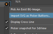
As you start from the picker panel, the buttons created during the import will be the children of the panel, you can also set an element / full image as the background image of the panel.
Go to the Image menu, and select
Import SVG as Buttons..
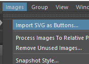
Without a destination, the buttons created will be placed directly to the scene, without any parent. You can then parent them to a group/panel using shift+P hotkey.
Once you pick up the primary base image, the dialog will pop up:
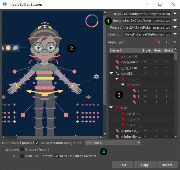
Area 1: The file path for the image of 4 states Hit the triangle button at the right to pick images, Alternately, Dnd images to the file path field.
Area 2: The SVG image preview area, which supports mouse interaction, e.g. click on an element and select elements. If you picked up images of 4 states, you will see the hovered elements using the same element from the hovered image, pressed element come from the pressed image, on release, if the element is set to be a select button, it will show the selection highlight elements.
💡 On import, each element will have its clip path of its own shape, on this preview view, it just should you a rectangle indicating its bounding box.
Area 3: The tree view shows you the element hierarchies. Use the button  to ignore them during import, and the
  button to set the element to select-button, command-button, and graphic item.
Area 4: The import option. You can choose to set an element/whole image as the destination picker scene’s or panel’s background image; Create a new group to contain all the imported buttons, and set its background image. Decide whether to scale SVG content to fit the destination picker panel visible area; Whether to use the element ID as select-button’s member.
💡 The configuration on this dialog will be remembered for the MG-Picker Session, once you pick the same base image, the same configuration will be picked up automatically. This setting will be gone in different MG-Picker Studio sessions.
You can export mgpicker to svg in UI so that you can edit it in vector programs, it also comes with API support here for more information.
There is also UI/API support for SVG batch import, check out here for more information.