Designer Mode
The basic workflow
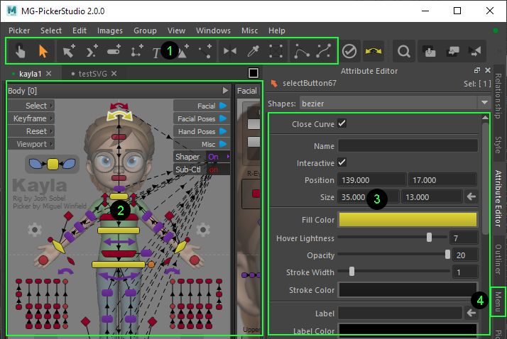
Switch to a certain tool in
Area 1;Create picker buttons and edit them interactively in
Area 2,To edit the picker items’ experience or their member/attribute data, select them and set up all kinds of properties in
Area 3,To attach/edit a popup menu to a picker item, use the menu editor in
Area 4.
💡 Use hotkey
F8to switch between animator mode & designer mode.
💡 Use Outliner to get an overview of all the picker items in the picker, regardless of the visibility.
💡 Use the Style panel to create a style library for quick application.
💡 Use the Relationship view to understand the visibility control relationship, as sometimes this is a bit hard to know what is happening in the picker view.
💡 Every widget control in this UI has attached a tooltip string. Hover the mouse upon it, read the pop-up tooltip and you should be ready to go.
Help Topics For Designer
- Quick Design Workflow
- The SVG-based Workflow
- Design Principles
- Namespace in MG-Picker Studio
- Picker Item Types
- Item shapes
- Links
- View Region
- Animation in MG-Picker
- Relationship panel
- Outliner Panel
- Picker Menu
- Picker Edit
- Style Library
- Picker File Distribution
- Picker Image Portability
- Picker Tool Integration
- Publish Picker To Internet
- Hotkyes in Designer Mode
- MG-Picker Studio as Standalone App
- Tips